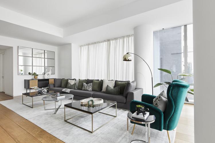
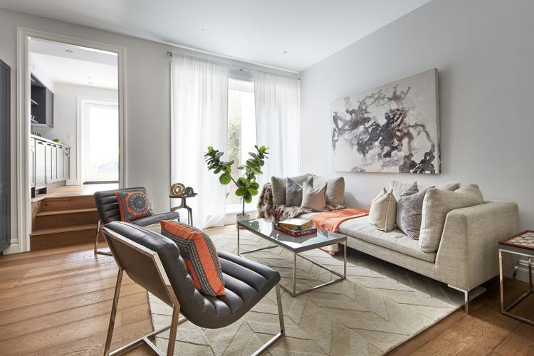
While neutral color palettes and “tone on tone” may appeal to those who love minimalism, adding a “pop of color” can help to energize a space.
Typically starting with a neutral foundation allows for the best ability to build or add pops of color throughout while also allowing the color to stand out and shine.
Popular pops of color
In general, the best pops of color are those that will stand out and allow a color to shine. Popular colors include green, mustard yellow, orange and blue.
How to incorporate pops of color
Pops of color can be integrated into a space in several ways. Some of the easiest ways are to incorporate pops of color through accents and accessories.
Quick ways to incorporate pops of color
• Toss pillows
• Throws
• Area rugs
• Artwork
• Coffee table books
• Vases and sculptural pieces
Top Do’s and Don’ts
Do:
Do integrate pops of color using portable design elements that can easily be swapped in and out like toss pillows and throws.
Do add pops of color that complement the existing colors in a space.
Do use pops of color to energize or invigorate a space.
Don’t:
Don’t blend too many dark or light colors in a space; instead use pops of color to add a sense of contrast.
Don’t over work your pops of color. Instead of overloading a space with color, use sprinkles of color.
Don’t overlook the colors black and white. These colors can be used within a room in powerful ways to add a sense of contrast and can be used as a color pop.
Cathy Hobbs, based in New York City, is an Emmy Award-winning television host and a nationally known interior design home staging expert and short-term rental/vacation home designer with offices in New York City and The Hudson Valley. Contact her at info@cathyhobbs.com or visit her website at cathyhobbs.com.